


This 2026 color forecast is all about emotional design and expressive palettes that are shaping branding, web, and visual storytelling.
As digital experiences continue to replace physical touch points, color has become one of the most powerful tools brands have to communicate emotion, personality, and intent – instantly.
In 2026, color trends are less about seasonal shifts and more about how people want to feel; comforted, energized, and inspired. The rise of expressive palettes reflects a move away from purely functional design and toward experiences that feel human, sensory, and emotionally intelligent.
These four palettes represent distinct, but connected, responses to that shift. Together, they map the spectrum of how color is evolving in web design, branding, and product. From grounding neutrals, to nature-led design, to playful pastels, to bold chromatic confidence.
Following color trends doesn’t mean chasing novelty. The most successful brands use trends as a filter, not a formula. They select colors that align with their values, audience, and long-term vision. The balance lies in adopting how color is used. For example, layering, contrast, warmth, playfulness, rather than copying what colors are trending outright. When done well, and that balance is achieved, trend-led colors feel authentic, strategic, and enduring. That is when brands evolve, but don’t lose themselves.
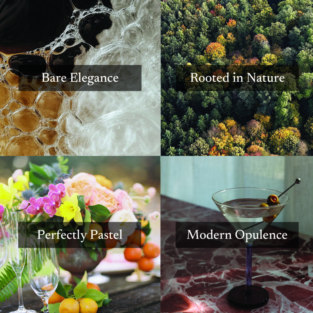
Palette 01 – Bare Elegance
Polished, understated, and editorial
This palette reflects the continued evolution of modern minimalism into warmer and more human. In a constantly connected world, we crave aesthetics that remind us of the softness of human kind. There is a growing preference for creamy neutrals, cosmetic beiges and softened browns that feel personal and tactile. Influenced by beauty, wellness, and interior design, these tones communicate care, intention, and quiet confidence. Rather than demanding attention, they create a sense of ease and polish. Clean, chic, and unmistakably modern.
Rather than relying on high contrast for impact, this palette creates interest through tonal variation. The result is an understated palette that is intentional, refined, and quietly confident.
This palette leads itself beautifully to beauty and skincare, jewelry brands, contemporary womenswear, wellness and self-care brands, stylists, content creators, consultants, and luxury and home brands. Due to the warmth and neutrality of the palette it works well across industries giving an approachable luxury aesthetic.
Elevate with this palette
In digital spaces, this palette offers a sophisticated alternative to high-contrast minimalism. Bone and Sand create soft, light backgrounds that reduce visual fatigue while maintaining clarity. Espresso, Toasted Walnut and Clay Beige provide structure for navigation and content without the harshness of gray. Blush and Dusty Rose work beautifully as highlights and accents while adding warmth and dimension.
The experience with this palette is elevated yet approachable. It is modern, refined, and intentionally calm. Soft pinks added as an accent to a neutral palette brings that human touch. These shades offer a nostalgic and calming escape from daily stresses.
This palette is built to live on its own or pair with deep rich shades like Pinterest Predicts Plum Noir or Jade. This palette, like all the others, was curated so that each shade speaks to its own story while serving a purpose all together.
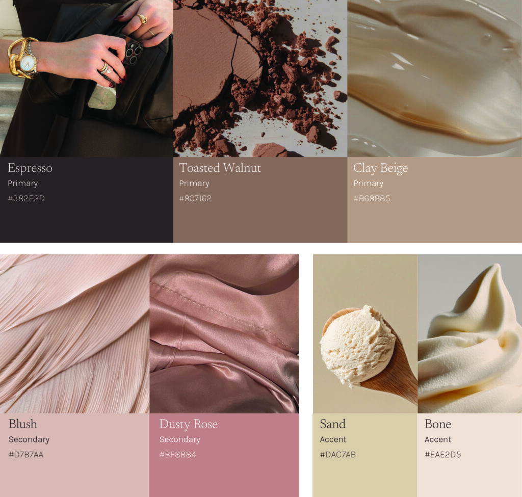
Espresso is a dark chocolate brown and grounding neutral. Over the last few years, dark browns have been replacing black as a dark neutral. They feel richer, warmer, and more dimensional. This aligns with the shift towards depth, tactility, and elevated minimalism. Espresso communicates sophistication without severity.
Toasted Walnut continues to trend as the bridge between gray minimalism and warm naturalism. It feels architectural and versatile, offering refinement without starkness. It supports the “quiet luxury” trend by feeling polished yet understated.
Clay Beige is strongly influenced by fashion and interiors. This shade evokes craftsmanship, natural elements, and longevity. This tone is grounded and feels timeless.
Blush Pink reflects the ongoing influence of beauty and skincare culture. They are soft and modern. This muted shade feels less romantic and more cosmetic, fueling the human element within this palette. Blush adds warmth without overpowering.
A deeper pink, Dusty Rose, introduces emotional warmth and subtle personality. It is expressive, but controlled. It brings color to a neutral and minimal space in a refined way.
Sand and Bone replace stark white in this modern palette. It softens digital environments, reduces contrast fatigue, and adds a premium, editorial sensibility.
Individually, each shade reflects the broader cultural move towards warmth, tactility, and elevated restraint. Together, they create a layered neutral system that feels clean yet dimensional.
Palette 02 – Rooted in Nature
Rooted in nature, refined for now
This palette balances weight and air. There is a continued rise in grounded, nature-driven color stories that feel restorative and intentional. Consumers seek balance in an overstimulated world so colors rooted in nature offer stability and emotional calm. This palette offers a sense of optimism and energy with Sunbaked and Lichen that keeps the palette from feeling too utilitarian
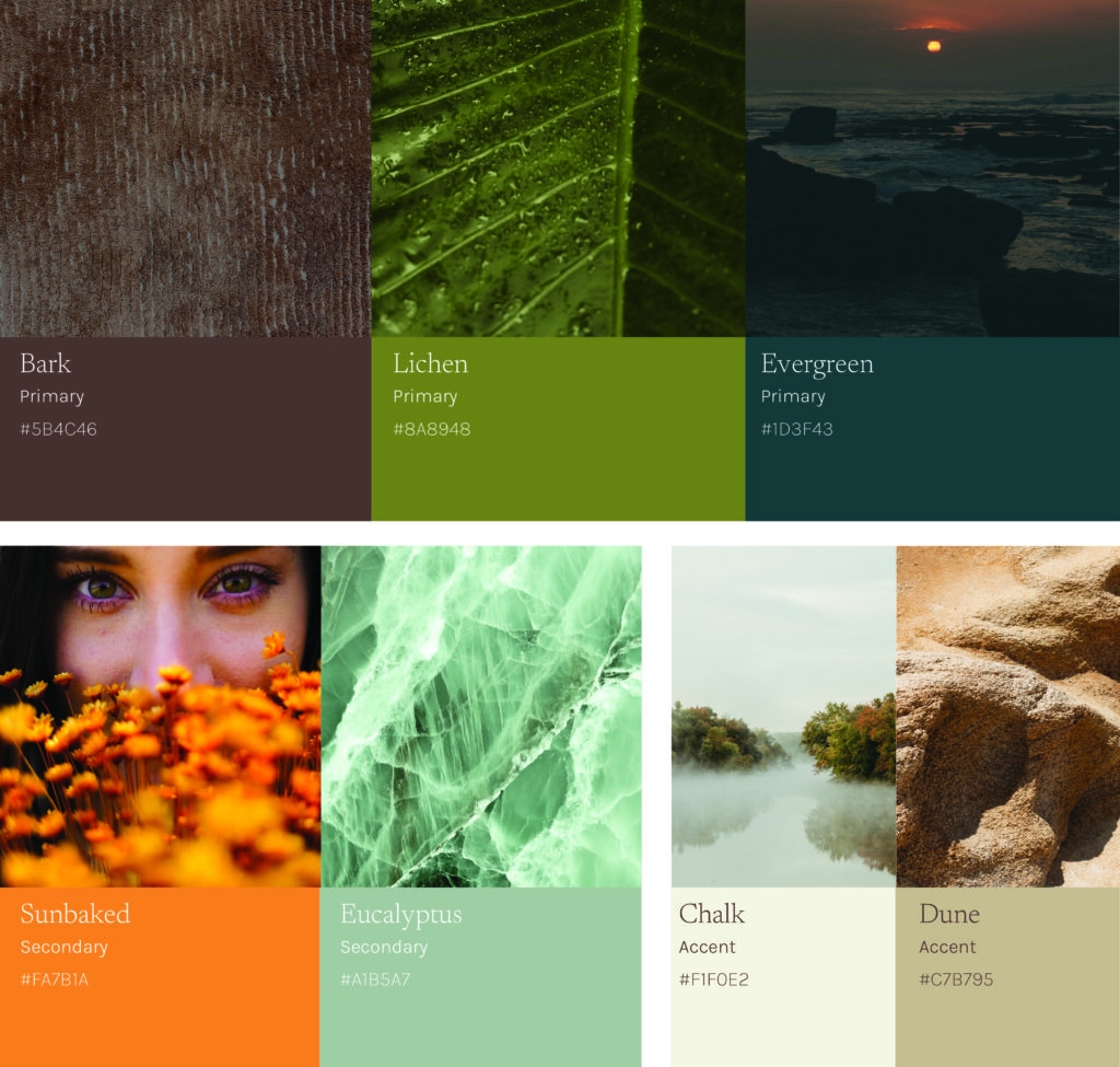
Bark and Evergreen act as the grounding shades in this palette, to provide richness and stability. Lichen and Eucalyptus are organic and calming. Sunbaked injects a sense of energy into the palette, while not overpowering. The neutrals, Chalk and Dune create space in the palette to take a deep breath. It is clean and contemporary but still has a grounding warmth to it. Like the sun hitting your face while you breathe in the fresh air.
This grounded and adventurous palette lends itself perfectly to outdoor and adventure brands, sustainable and eco-conscious brands, travel and experience brands, adventure photographers and ethical lifestyle brands.
Find balance with this palette
Within a digital space, this palette is perfectly balanced. There is depth without relying on stark contrast. Bark and Evergreen work beautifully as grounding and rich backgrounds. These deep shades are a softer alternative to black. Lichen and Eucalyptus are unexpected mid-tones that offer contrast while still maintaining a cohesive natural feel. Sunbaked is the perfect shade for call-to-actions, drawing attention without feeling aggressive. Lastly, Chalk and Dune work as clean neutrals that create breathing space to support readability and accessibility.
Together, the palette feels calm and considered, clean and chic, emotionally warm, and rooted in nature but refined for now.
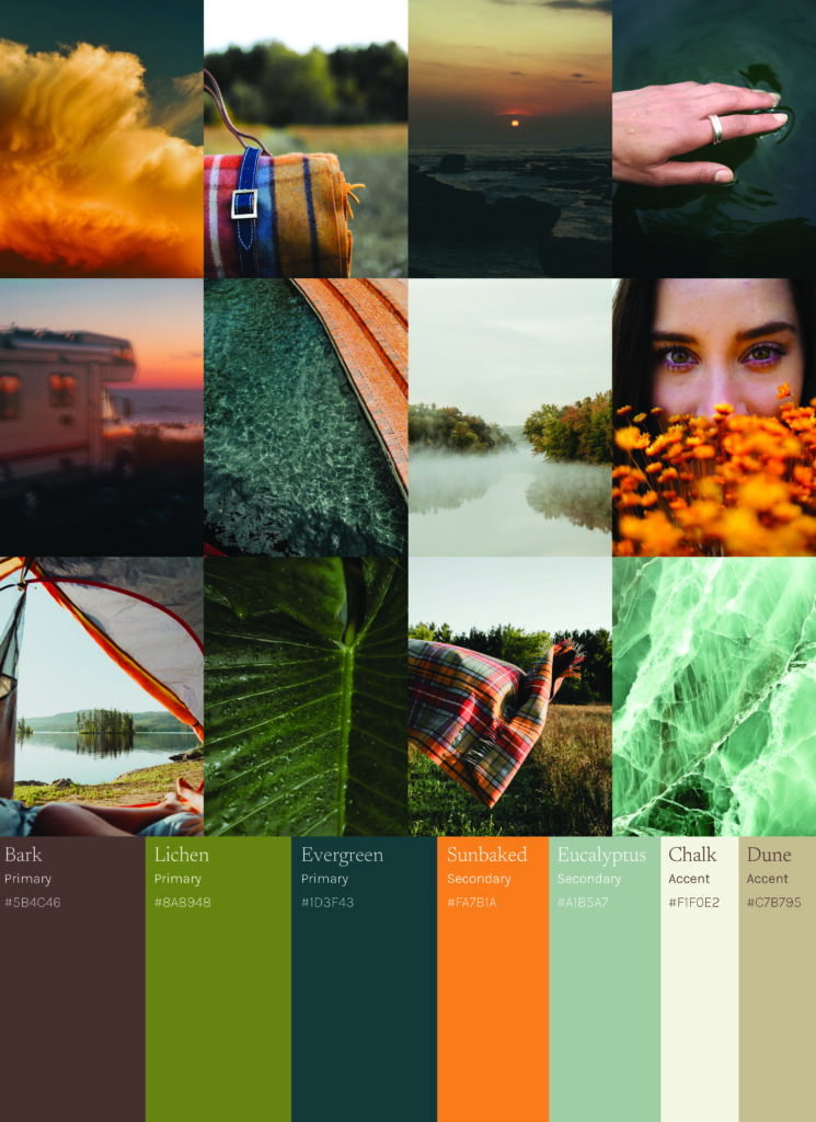
Each of these shades reflects a desire to feel grounded amongst the chaotic, always connected, world that we immerse ourselves in. By using colors inspired and found in nature, we get a sense of relief. This color story shows depth, authenticity, and an emotional calmness.
Rich Browns, like Bark, feel grounded and authentic, signaling durability, craft, and honesty. This shade and what it represents aligns with the broader return to heritage tones nature inspired shades in both interiors and fashion.
Lichen green aligns with Pinterest Predicts, Wasabi, which is forecasted for their 2026 color palette in a more natural and refined way. This shade bridges utility and lifestyle. It communicates sustainability, resilience, and effortless versatility.
Evergreen, a shade that is forecasted from WGSN as the color of the year for 2026 is sophisticated and versatile. It is as stable as navy, but with an organic undertone that feels immersive and calm.
This palette brings in Sunbaked as a sense of optimism and human warmth. Orange is having its moment, starting in 2025 and continuing into 2026. Aligning with Pinterest Predicts, Persimmon, orange is a feel good shade that brings a burst of pure joy.
Eucalyptus is a therapeutic shade that speaks directly to wellness and balance. It is restorative, soft, and approachable. This calming shade aligns with Pinterest Predicts Jade that offers serenity and elegance.
The warm neutrals that accompany this palette, Chalk and Dune work effortlessly, add breathability, and reinforce tactility within this nature inspired color story.
Together, these tones represent a modern evolution of outdoor influence. Less rugged, more refined.
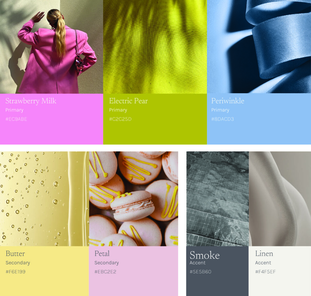
Palette 03 – Perfectly Pastel
Delicate tones, daring combinations
This unexpected palette is perfectly composed and intentional. This palette is editorial but approachable. There is a balance of softness and structure, warmth and clarity, and trend relevancy and longevity. It is refined enough for the premium and friendly enough for the everyday.
Perfectly Pastel captures the shift toward optimistic maximalism, where soft pastels are used boldly and mixed in new and unexpected ways. Youthful consumers are craving color that feels joyful, expressive, and personal, without sacrificing polish and refinement. There is a sense of confidence and playfulness in Strawberry Milk, Butter, Electric Pear, and Periwinkle. The neutrals in this story keep the palette refined and intentional. Together, the story feels fresh, modern, and emotionally engaging. They are pastels with a presence, designed to stand out while still evoking a feeling of being elevated and cohesive.
This palette would fit well with food and beverage brands, experience and event brands, beauty and wellness, creative agencies, family lifestyle brands, and modern kids brands. This palette offers optimism and playfulness.
Be daring with this palette
Within the digital and branding space, this palette delivers immediate emotional impact and memorability at first touch. Brighter tones like Butter and Electric Pear act as natural attention grabbers and work well for attention grabbing content. Softer shades like Periwinkle, Strawberry Milk, and Petal work well as backgrounds without visual fatigue.
The colors are distinct enough to stand on their own, but together they create a system that is distinct enough to stand out on crowded feeds. The palette is cohesive and calm enough to build trust and longevity, but fresh enough to bring joy and personality.
The individual relevance of these colors is what makes this palette feel intentional, not just pretty.
Strawberry Milk is mature, but playful. This shade moves beyond just representing soft femininity and sugary imagery to softness can represent strength. This shade also allows digital spaces to show a modern take on humanizing and warmth, without leaning on nostalgia.
Electric Pear is a key color because it brings unexpected energy. This shade has optimism and edge, perfect for capturing younger audiences. Similar to Pinterest Predicts, Wasabi, this color signals experimentation and creativity.
To balance Electric Pear, Periwinkle offers a calming counterpoint to the high-stimulation digital environments. It bridges emotional comfort with digital clarity, making it especially relevant for technology-driven brands seeking warmth without losing credibility.
Butter yellow, a shade that continues to be the “it” color for 2026. It is warmer and softer than traditional brights, so it brings lightness and joy without the visual strain. The color aligns with a collective desire for comfort, positivity, and ease.
Petal acts as a new neutral, replacing beige in this story. It offers warmth and personality with subtle depth and sophistication. This is a perfect alternative to stark backdrops.
These neutrals are subtle shifts to what we traditionally expect. Smoke offers a softness that harsh black can not. Linen, Pantone’s color of the year, offers a subtle shift from stark white.
This palette builds with each shade, allowing a shift between calm and expressive moments without breaking visual consistency. The story overall feels youthful yet refined, maximalist yet considered. It is meant to stand out and be memorable.
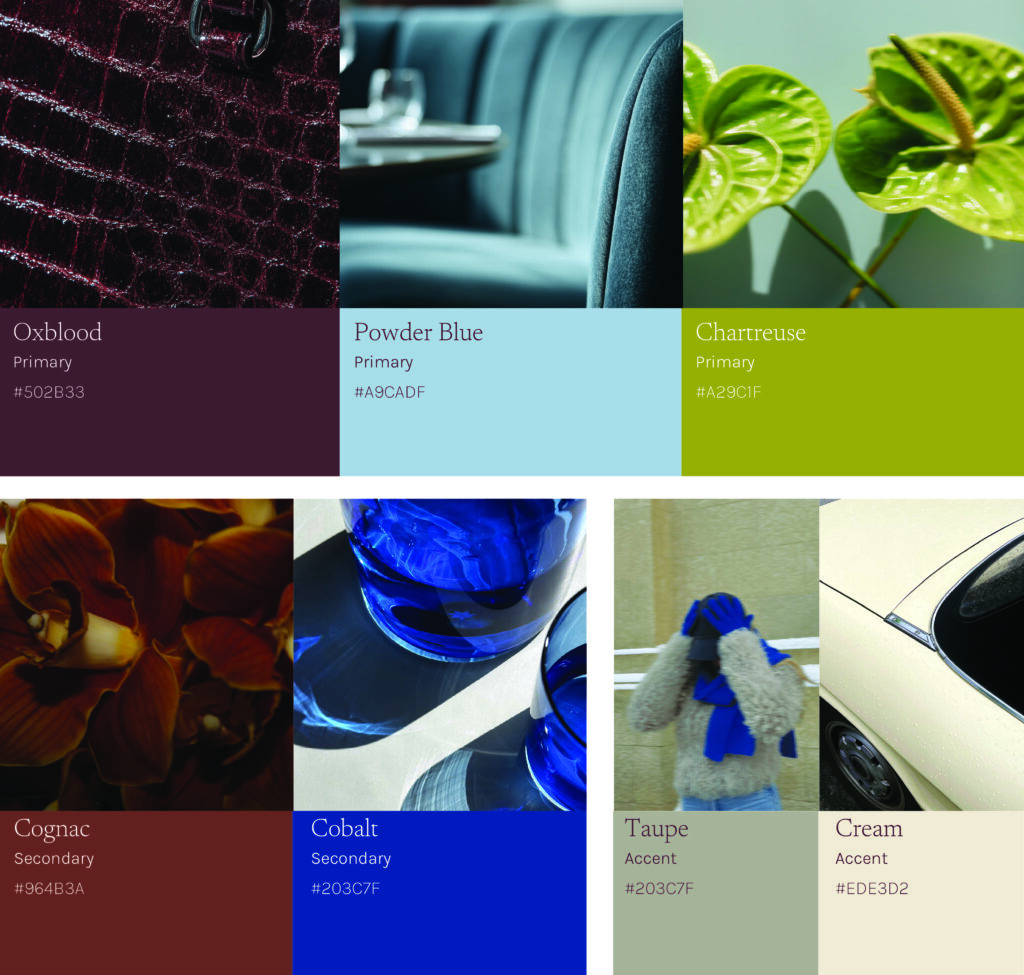
Palette 04 – Modern Opulence
Confident, Cultured, and a little bit indulgent
This color palette offers bold contrasts but is grounded in deep richness. These unexpected pairings with Oxblood, Chartreuse, Cobalt, Powder Blue, and warm neutrals feel collected rather than trendy. Together they feel editorial, tactile, and high-end. They are rich without excess, bold without chaos. This palette allows brands to project confidence and cultured depth while still maintaining clarity, accessibility, and usability.
Modern Opulence reflects a broader shift toward expressive confidence and curated indulgence. We are moving beyond minimal restraint and leaning into saturated, layered color stories that feel intentional and worldly. Deep Oxblood and warm Cognac signal heritage and craftsmanship that offers a comforting sense of nostalgia. Chartreuse and Powder Blue ground the palette in nature with a modern flair. The bold cobalt injects optimism and clarity, creating a tension that feels daring yet elevated. Together, these hues balance familiarity and fashion-forward contrast that makes this palette feel elevated, confident, and unapologetic.
This editorial and sophisticated palette lends itself best to elevated dining and boutique hospitality brands, fashion and accessories brands. stylists, graphic designers, creative consultancy brands, beauty and fragrance brands, and interior design brands.
Indulge with this palette
In a digital environment, Modern Opulence translates into immersive, premium storytelling. Dark and saturated backgrounds like Oxblood and Cognac replace flat black with warmth and dimensionality which creates a more elevated visual. Chartreuse and Powder Blue provide layered hierarchy across navigation, and secondary elements, adding refinement without noise. Cobalt becomes a powerful and deliberate accent, ideal for elements that demand attention while maintaining sophistication.
This color palette relates to some of Pinterest Predicts trends forecasted for 2026. Modern Opulence has elements of Glamoratti and Poetcore but really brings Neo-Deco to life. Neo-Deco is a take on art-deco, but with a modern twist to bring it to 2026. After years of heavy minimalism, we are ready for bold, glam, and just a touch of eccentricity, according to Pinterest Predicts.
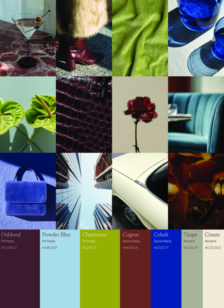
Each color in this palette is perfectly curated to tell a story on its own, and together.
Oxblood, deep and decadent, mixes burgundy with a bit of deep brown. This shade continues to rise in popularity because of the longevity and versatility it has. The blackened nature of this color allows it to pair well with high-contrast vibrant colors. This shade also aligns with Pinterest Predicts Plum Noir in their 2026 color forecast.
Powder Blue offers a place to cool down the palette, while warm shades have been taking over. This icy mid-tone aligns with Pinterest Predicts 2026 forecasted, Cool Blue. It is icy chill while still having a retro warmth.
Chartreuse adds the vibrancy this palette needs to bring it all together. This acidic tone aligns with Pinterest Predicts Wasabi in a toned-down way. It feels like a fuzzy velvet version to the vibrant green they have predicted.
Cognac evokes the feeling of nostalgia. Rich and solid materials that stand the test of time and have stories to pass down for generations to come. A feeling we are all longing for in today’s chaotic world.
Cobalt, a primary shade that is a favorite to many but injected with a sense of optimism for the future. WGSN has forecasted Luminous Blue, a vibrant shade of cobalt as the color of the year for 2027. So expect to see more of this color as the popularity of this shade builds.
Warm neutrals continue to offer comfort within the palette. They evoke a sense of softness and security while they ground the palette.
Modern Opulence is a study in confident contrast. A richly layered palette that balances depth and clarity, expressing a point of view that is confidence, cultured, and just a bit indulgent.
What You Can Do Right Now
Small updates this week:
- Test Bare Elegance neutrals in your brand palette
- Swap stark black for Espresso or Bark
- Pick one accent color from your current palette or borrow one of our (heyyyy, Modern Opulence!) and use them for CTAs
For your 2026 refresh:
- Audit your palette against these 4 trends
- Layer in tonal variation for depth
- Book a discovery call so we can talk about your brand design goals!


Comments +