


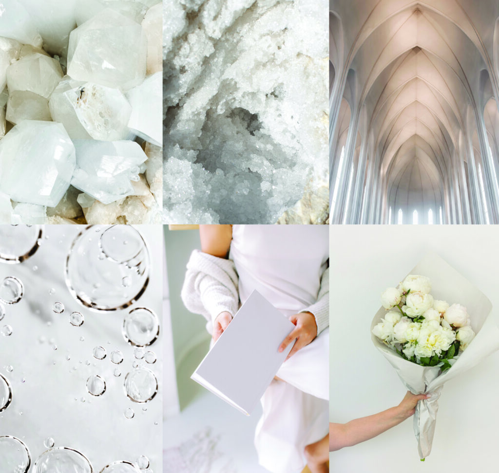
The Color of the Year is…White
Why Cloud Dancer
Pantone’s Color of the Year for 2026, Cloud Dancer, arrives like a collective exhale. In a moment defined by constant stimulation and uncertainty, this soft, nuanced off-white feels less like a blank canvas and more like a necessary pause. It signals a cultural shift toward calm, restraint, and quiet reflection. Values we may not have realized we were craving, but deeply need now.
Color trends have always acted as emotional barometers, mirroring the social, technological, and psychological climate of their time. As we navigate a world that feels increasingly chaotic, Cloud Dancer offers visual breathing room. Its understated clarity creates space to process, reset, and recalibrate. This isn’t about emptiness, it’s about intention. About removing excess noise to make room for meaning.
We’re living in a tension between an accelerating digital future and a renewed desire for real, human connection. AI and innovation inspire optimism, yet they heighten our need to preserve what makes us human – emotion, individuality, presence. Cloud Dancer reflects this in-between state: a color that grounds without weighing us down, that feels modern without feeling cold. It supports disconnection from overwhelm while still holding space for connection.
More than a neutral, Cloud Dancer is a mood. It represents a collective desire to start fresh and to move forward with quiet optimism. It says everything without demanding attention.
As we explore Pantone’s Cloud Dancer across the palettes ahead, its true strength is revealed. The shade is a versatile foundation that harmonizes bold and subtle shades alike, allowing color stories to breathe, balance, and resonate with clarity in a complex world.
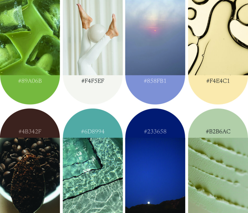
Checking out is the new luxury
In a world defined by constant decision-making and perpetual urgency, the ultimate luxury has become the ability to step away. We’re experiencing decision fatigue at unprecedented levels, and culturally, there’s a growing desire to remove friction. We see this through blind boxes that eliminate choice in favor of joy, or through gap years, mini sabbaticals, and career pauses embraced especially by younger generations. “Checking out” is no longer escapism; it’s self-preservation.
This palette responds directly to that mindset. Anchored by Cloud Dancer, the palette creates a soft and breathable foundation. One that quiets the visual field and allows the surrounding colors to feel restorative rather than demanding. Cloud Dancer acts as the pause between thoughts, giving the palette emotional clarity and a sense of intentional restraint.
Therapeutic blues expand the palette with a feeling of serenity and mental ease. Long associated with calm and trust, blue evolves here into something more contemplative, inviting stillness rather than stimulation. Grounding greens and earthy neutrals connect us to nature’s inherent healing qualities, reminding us that restoration doesn’t always require escape. Even when sabbaticals aren’t possible, moments outdoors, tactile materials, and nature-inspired environments can offer micro-resets for the mind and body.
Together, these hues form a wellness-driven color story rooted in balance—mental, physical, and emotional. This is color as care. A palette designed to soften the edges of daily life, reduce sensory overload, and redefine luxury as time, space, and the freedom to simply be.
This therapeutic and restorative palette works well for wellness, mental health, and therapy brands, retreat and slow travel brands and content creators, spas and beauty.
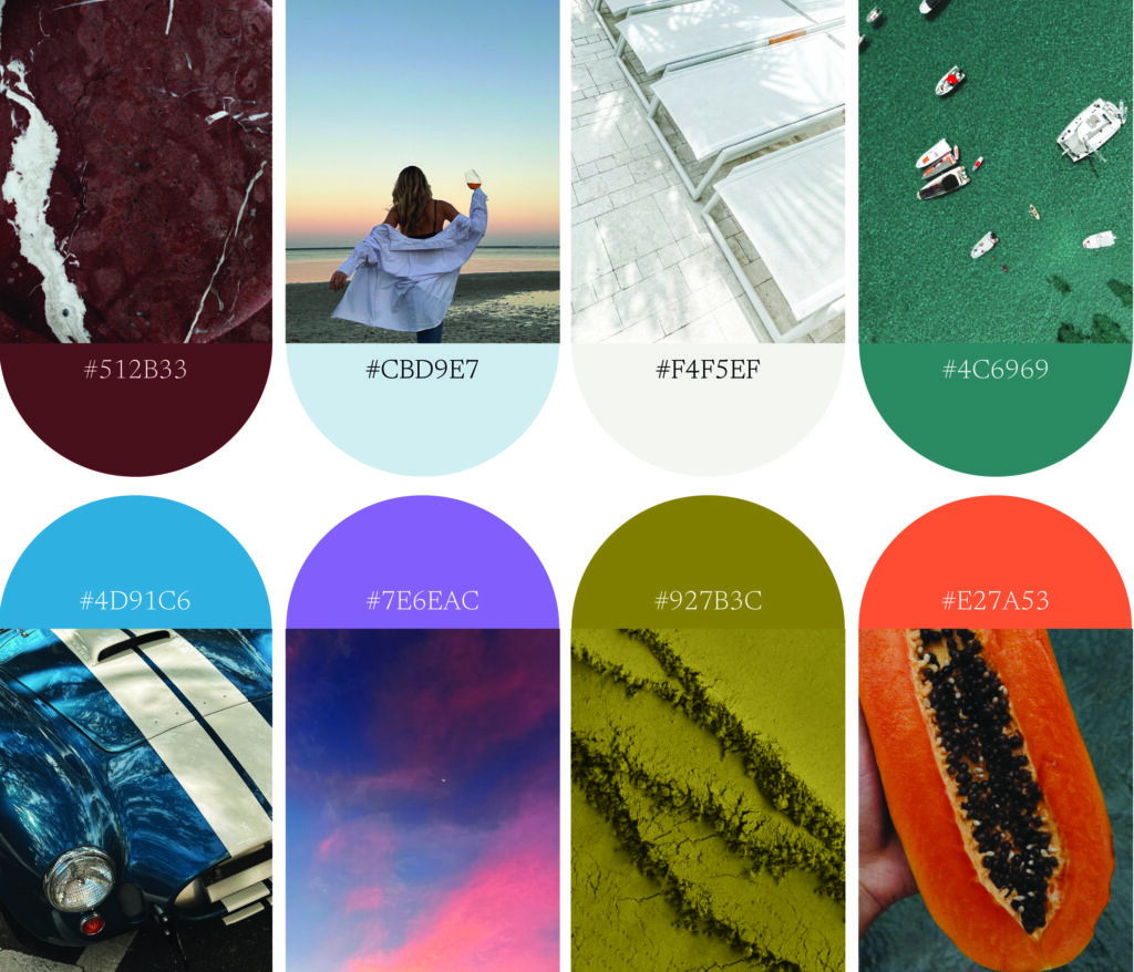
Less, but better
Cloud Dancer was named Pantone’s Color of the Year because it represents a true reset. Clean, quiet, and understated, it reflects a growing cultural rejection of excess and overconsumption. As we move into 2026, more people are questioning the idea that having more leads to living better, and instead embracing a philosophy of doing less, owning less, and choosing with intention.
This mindset shift shows up everywhere. Rather than aspirational hauls, social feeds are filled with “things I won’t be buying this year”—a quiet rebellion against impulse culture and trend churn. The desire to check out isn’t just about rest. It’s about editing. Removing visual, mental, and physical clutter to make space for what truly matters.
This palette is built on that restraint. Warm and cool neutrals work together to create depth without noise, offering a sense of balance that feels both modern and grounded. These hues don’t compete for attention, they support one another, creating a calm, cohesive system designed for longevity rather than immediacy.
At the center of it all is Cloud Dancer. Acting as the foundation, it brings clarity and lightness to the palette. Its versatility makes the palette inherently flexible. It is timeless on its own, yet capable of supporting bolder accent colors when desired. This is minimalism without austerity. Simple, but never sterile.
For 2026, this palette reflects a new definition of luxury. Thoughtful choices, lasting design, and the confidence to let quiet speak louder than excess.
This modern and minimalistic color palette can be used for luxury skincare and beauty brands, home and interior design brands, organization brands, coaching and strategy brands, and creative consultants.

Curated Chaos
While Pantone’s Cloud Dancer feels like a natural fit for minimalist spaces, its real versatility is revealed when it’s placed in contrast. In 2026, a renewed appetite for maximalism is emerging. Not as excess for excess’ sake, but as a form of self-expression and creative freedom. After years of restraint, people are ready to be seen again.
This palette celebrates bold, unexpected color pairings and confident contrasts. Saturated hues, earthy brights, and moody tones coexist in a way that feels intentional rather than overwhelming. It’s maximalism with a point of view, where eclectic styling and expressive color choices communicate identity and individuality.
Cloud Dancer plays a critical role here. Acting as a visual reset within the palette, it creates space between strong colors, allowing them to shine without competing. Its softness tempers intensity, providing balance and cohesion while keeping the palette from tipping into chaos. In this context, Cloud Dancer isn’t quiet, it’s strategic. It gives bold color permission to exist more freely.
This return to expressive color is a direct response to cultural fatigue. As digital personas blur and algorithmic sameness takes hold, people are reclaiming creativity through risk-taking and personal style. Color becomes a language, one that’s playful, emotional, and unapologetically them.
For 2026, this palette reflects a desire to break patterns, embrace contrast, and design with confidence. It’s about having fun with color again, without losing intention or meaning.
This palette leads with intention and would be great for fashion and lifestyle brands, food and beverage brands, community driven brands, travel and experience brands, and nail or hair brands.
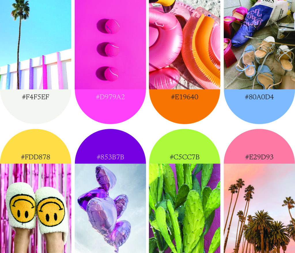
Play is the Point
In 2026, joy is no longer a side effect—it’s a priority. After years of emotional heaviness and responsibility, there’s a growing desire to reconnect with play, optimism, and childlike wonder. This palette taps into a renewed cultural appetite for brightness and boldness. Fueled by nostalgia for simpler, more carefree moments and a collective need to feel something positive again.
Highly saturated colors are returning as a form of emotional expression. They cut through digital monotony, stand out in algorithm-driven feeds, and signal confidence in a world that’s felt muted for too long. These hues feel expressive, energetic, and unapologetic. They invite fun back into everyday life through color.
Within this exuberance, Cloud Dancer plays a vital role. Acting as a visual pause, it creates moments of softness that allow bold colors to shine even brighter. Its clean, airy presence prevents saturation overload, giving the palette rhythm and balance. Cloud Dancer becomes the reset between bursts of color. A place for the eye to land before diving back into play.
This palette embraces contrast: light and bold, calm and energetic, refined and joyful. It encourages experimentation without apology, reminding us that play isn’t frivolous, it’s restorative. For 2026, color is giving us permission to loosen the rules, embrace optimism, and design with delight.
This joyful and expressive palette lends itself perfectly to social first brands, youthful focused brands, content creators, mentor and community engagement brands, and creative consultancies
Building on Cloud Dancer
Pantone named Cloud Dancer the Color of the Year because it reflects a collective shift in how we want to live, feel, and design. Across all four palettes, Cloud Dancer acts as the constant, an emotional and visual anchor that responds to a world craving balance, intention, and clarity. Whether it’s supporting wellness-driven, nature-based hues, grounding warm and cool neutrals rooted in simplicity, creating space within expressive maximalism, or offering a pause between bold, playful bursts of color, Cloud Dancer proves its versatility and relevance.
In 2026, design moves fluidly between checking out and showing up. Between restraint and self-expression, calm and joy. Cloud Dancer allows all of these moods to coexist. It gives us permission to reset without erasing personality, to embrace color without overwhelm, and to move forward with optimism rather than excess. More than a neutral, Cloud Dancer captures the emotional landscape of the moment: a desire for quiet confidence, thoughtful choices, and a future that feels lighter, more human, and intentionally hopeful
Next Steps
Sometimes all it takes is one conversation to see your brand differently. Book a discovery call. We’d love to help you move forward in your brand goals.


Comments +